 Back
Back
What is this about?
MULA is a mobile-first investment platform designed to make wealth-building feel accessible, not intimidating — built for a generation of Ghanaians who are ready to invest but don't know where to start. Here's how it came together.
Backstory
The person who almost didn't start
Picture someone who opens an investment app for the first time. They're motivated, they have money to put in, they're ready. Then the dashboard loads — a wall of metrics, unfamiliar terms, no clear place to begin. They close the app. They don't come back.
That's not a hypothetical. That's the reality for most first-time investors in Ghana today. The platforms exist, but they weren't designed for the person who's just starting out — they were designed for people who already know what they're doing.
That gap is what MULA was built to close.
The Goal
The brief wasn't just to make something pretty. It was to design a product that could hold two very different users at once — the complete beginner who needs guidance before they do anything, and the experienced investor who wants to move fast and stay in control.
The platform needed to let users trade and manage investments without friction, learn as they go without feeling talked down to, track their portfolio performance in real time, and explore financial products from institutions they could trust.
One app. Two audiences. Zero compromise on either.
My Role
End-to-end product design — from first sketch to high-fidelity prototype
This one was mine from the ground up — no handoffs, no half-finished flows inherited from someone else's Figma file. Just a brief, a client, and a lot of sketching.
- Defined the product vision with the client
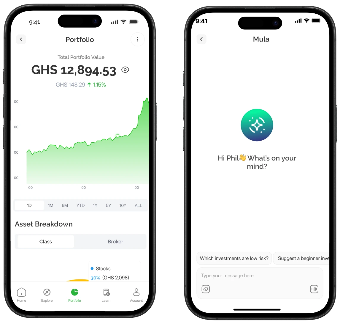
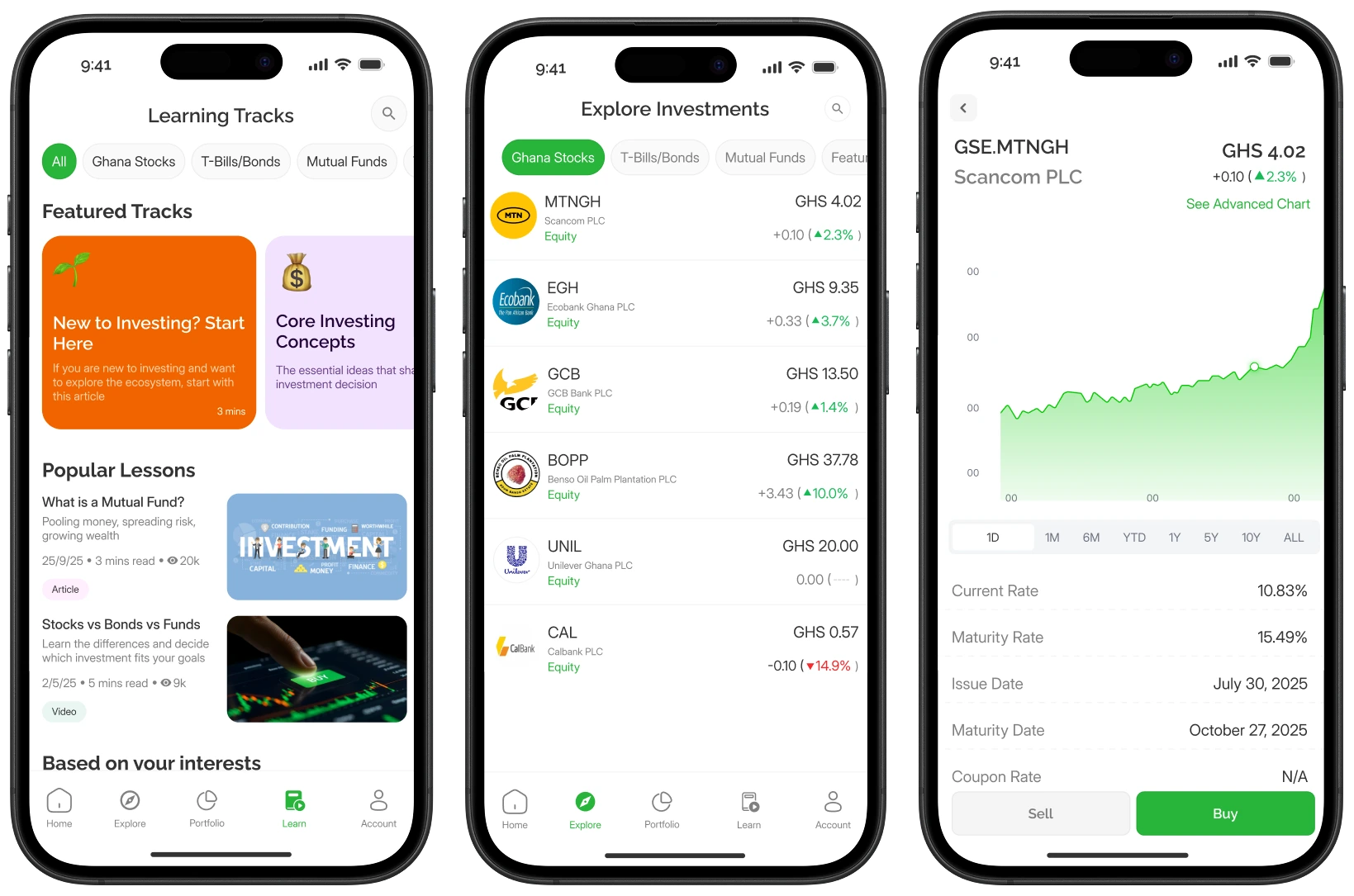
- Built and connected three core experiences: Learn → Explore → Portfolio
- Ran usability walkthroughs and iterated based on real feedback
Research
Before I opened Figma, I spent time inside every major investment app I could get my hands on — as a user, not a designer. I wanted to feel what first-timers feel
What I found was consistent. Dashboards that front-load too much information, assuming the user already has context they don't have. Onboarding flows so long and form-heavy that users drop off before they ever reach the product. And almost no educational layer — no way for someone new to build enough confidence to actually make a move.
The apps were built for the already-converted. MULA had to be built for everyone else.
- Dashboards that front-load too much, too soon
- Onboarding so long users drop off before they reach the product
- Limited educational support for users new to investing
Ideation
Figuring out the structure
Using mind maps and user flow sketches, I explored how to merge three core experiences — learning, exploring, and managing investments — into one intuitive structure. The idea was to reduce decision fatigue and guide users naturally from learning to trying to investing, confidently.
Design Process
Building the Flow
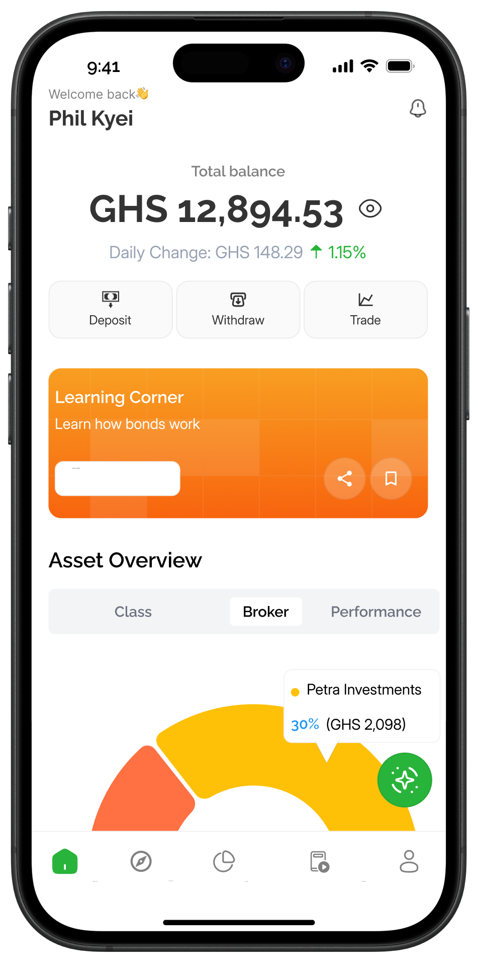
The product experience was shaped around three core moments: learning the basics, exploring opportunities, and tracking performance. Each section was designed to feel quick, scannable, and reassuring, so users can move from understanding to action without getting overwhelmed.
Testing & Iteration
When I ran usability walkthroughs with target users and the client, two things came back consistently: the analytics felt complex, and the path to placing a trade had too many steps. Both were fair.
I simplified the analytics view — stripping it back to the metrics that actually drive decisions and pushing the deeper data behind a tap for users who want it. I also shortened the trade flow, removing confirmation steps that added friction without adding genuine safety. The result was a product that moved faster without feeling reckless.
The Final Design
MULA ended up as something I'm genuinely proud of — a fintech product that doesn't feel like fintech. It's calm where most investment apps are frantic. It guides where others assume. And it trusts the user to grow into the product, rather than demanding they arrive already knowing everything.
Impact
The client had the vision. I just made sure the product could actually back it up. When we ran it by testers, two things kept coming up — how easy it was to move around, and how the app made investing feel like something they were choosing to do, not something happening to them. For a product built for first-timers, that's the whole point.
Thoughts
Honestly, MULA shifted how I approach fintech design. When someone's making decisions about their money, the stakes are real — so the design has to earn their trust before it earns their attention. I learned to think about the feeling first, then the layout. The goal was never to impress anyone. Just to make something that actually works for the person using it.